UX Crimes

User Experience (UX) is about user satisfaction. One of the building blocks is understanding and specifying how the product should behave, brain shouldn’t have to expend a ton of energy to figure out what the heck it’s looking at. The golden rule: make things as clear as you can.
"Whenever a man does a thoroughly stupid thing, it is always from the noblest motives." Oscar Wild
I agree but sometimes I just don't get the intention. How the f* does it came to him? It's like switching colours on traffic light. Here is my my small hall of shame:
#1 UPC (Cable TV Service)
I think this even not need comment :-) up and down, down and up or ..

#2 VSCO - Photo editing app
I love and hate this app at the same time. I love the minimal design, but it's not user friendly at all. Can you tell what are the upper right two icons!? user should know the meaning of icons at first sign. Not after investigating what each button does. These are settings (left) and market place (right). #lol

#3 iOS 10 - Music app
Let's say you want to dismiss the modal window and .. it's like you have to be surgeon to achive this. Other thing I really hate, that in the bottom bar are 3 of 5 items useless for me. And you don't have option to change it ( how it used to be in previous versions of Music app )

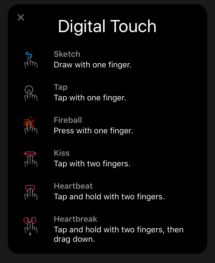
#4 iOS 10.x message app
Maybe I am too old, but I really don't know how to control this beast. Event with this nice help window. It's.. Just.. I.. Lets have a moment of silence for iOS 9.x

It looks like now I don't like iOS and the apple world anymore. That's not true. I still love the Steve Job's legacy, but hope it's not just legacy..


