Angular 2 Material Design Spinner .svg

For loading your Angular 2 app (which can be around 2MB big) is pretty useful to have the material design spinner in .svg. So you can show the loading spinner while the app is loaded. It's not so cool as <md-spinner></md-spinner> but it's still pretty straight forward.
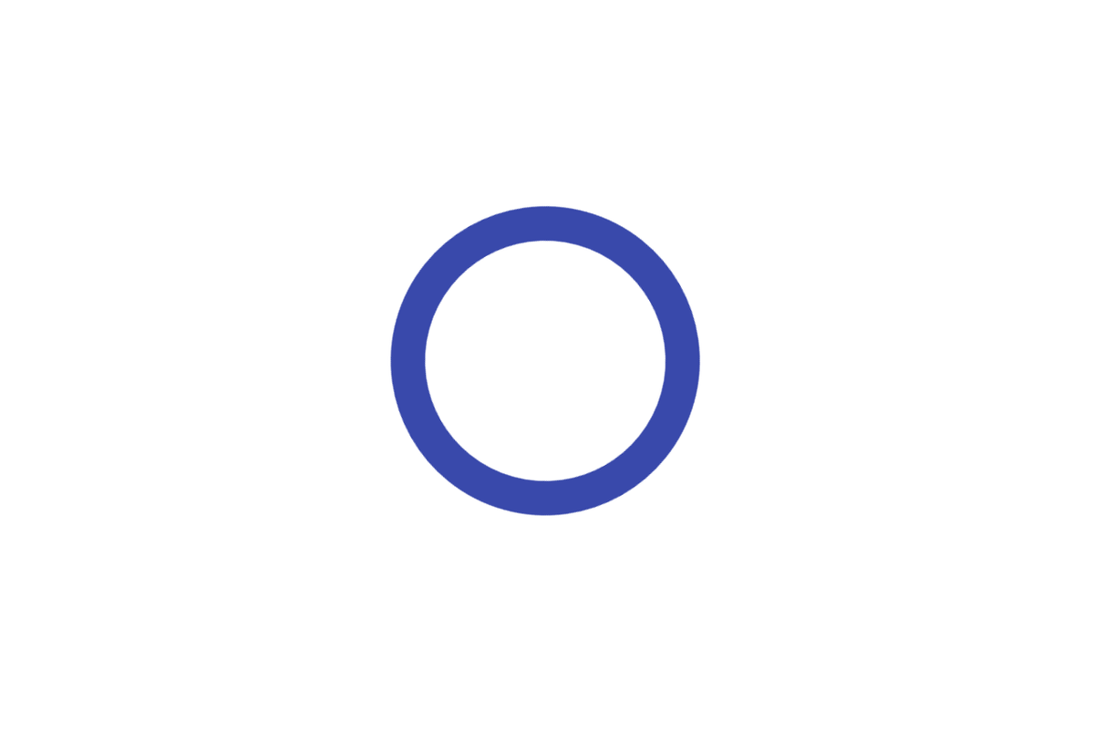
The md-spinner is currently available in 4 default material design colors:
| md-spinner-deeppurple | md-spinner-indigo | md-spinner-pink | md-spinner-purple |
Below is code snippet for svg. You can find out that all the magic happens in CSS3. I have created <circle></circle> first and then make it rotate with rotator animation. Next I have styled the circle with stroke-dasharray and stroke-dashoffset, for the effect of break circle. In last step I set dash animation, where I use dash-offset and rotation for the "slinky spring" effect.
(File is .xml because github renders .svg)
The loading bar is in progress and will be available soon. You can get md-spinner SVGs on my github page.


